Field Trip
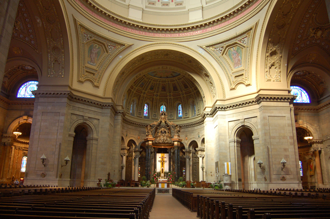
On May 12, our interior design class took a field trip to the Twin Cities to visit some highly architectural areas. Our first stop was James J. Hills house and we got to learn a little bit about the house along with most of summit ave. homes from a tour guide. Every home had its own unique style and stories to go with each. The last stop we made was the St. Paul Cathedral. This was also a tour and we got to learn a lot about what each statue meant, how the Cathedral was found, and other very interesting facts about the incredible architecture.
The James J. Hill house was built by James Hill and was completed in 1891. James was born sept. 16, 1838 in Ontario Canada. He later created the Great Northern Railway Company, which was responsible for huge railroad expansions in the U.S. Northwest. Mark Fitzpatrick was the architect for this monstrous home along side James Hill himself. The house has 36,000 square feet of living space.


Originally, in 1859 a photograph by Joel Whitney shows six houses on the hill along Summit Ave. Edward Duffield Neill owned the first house on Summit Avenue, in a location now occupied by James J. Hill House. Continuing to the left, the photo shows the houses of William and Angelina Noble, Henry F. Masterson, Henry Mower Rice, Henry Neill Paul, and David Stuart. Now the street is full of houses for about 4 1/2 miles. Back then the styles that were common on Summit were Queen Ann and Victorian with some Italian architecture. My two favorite houses were Edward T. Buxtons House, and William Butlers "Lemon Merinque" House. These were my favorite because both had that Italian, Mediterranean feel to them which I love, On the tour I learned that there were 3 houses before the James J. Hills House is located now. I also learned that the statue of Nathan Hale has no significance to Minnesota at all and is rumored to not even be him.
Edward Buxtons House William Butlers House


Originally, in 1859 a photograph by Joel Whitney shows six houses on the hill along Summit Ave. Edward Duffield Neill owned the first house on Summit Avenue, in a location now occupied by James J. Hill House. Continuing to the left, the photo shows the houses of William and Angelina Noble, Henry F. Masterson, Henry Mower Rice, Henry Neill Paul, and David Stuart. Now the street is full of houses for about 4 1/2 miles. Back then the styles that were common on Summit were Queen Ann and Victorian with some Italian architecture. My two favorite houses were Edward T. Buxtons House, and William Butlers "Lemon Merinque" House. These were my favorite because both had that Italian, Mediterranean feel to them which I love, On the tour I learned that there were 3 houses before the James J. Hills House is located now. I also learned that the statue of Nathan Hale has no significance to Minnesota at all and is rumored to not even be him.
Edward Buxtons House William Butlers House
The building of the St.Paul cathedral was instigated by Archbishop John Ireland in 1904. The site before was occupied by the mansion of entrepreneur Norman Kittson. Charles Smith and Alpheus Beede Stickney, two businessmen in St. Paul, purchased the land and donated it to the archdiocese. At Ireland's direction, the archdiocese commissioned well known French Beaux Arts architect Emmanuel Louis Masqueray, who was also the chief architect of the 1904 Worlds Fair in St. Louis, Missouri, and construction began in 1906. He had a budget of $1 million, and he based the cathedral on the designs of French churches of Perigueux Cathedral at Perigueux and Sacre Coeur basilica in Paris, as well as French Renaissance and Classical themes. The interior is illuminated by twenty-four stained glass windows. There is also a rose window in the transept. Electric lighting was installed in 1940. The cathedral has statues of the four evangelists in the four corners of its main pier.