Color Text Questions
1- Factors that can influence peoples reactions to color include age, gender, culture, and life experiences.
2- Red The color of red is associated with power, danger, fire, and passion. It is a bold, aggressive, exciting, and a warm color. It demands attention. Red can make you feel energetic, however to much red can make the room feel overpowering.
Green Green is the color of nature. It is refreshing, friendly, cool, and peaceful. Additional meanings include hope, good luck and envy.
Violet Violet is a royal color. It is dignified and dramatic.
3- The secondary colors are orange, green and violet. Yellow and red make orange, blue and red make violet, and blue and yellow make green.
4- when talking about tertiary colors, the primary color is listed first.
5-Color intensity is the brightness or dullness of a hue. The middle ring on a color wheel is a colors normal intensity.
6- The difference between a shade, tone, or tint is this. Adding white to a color is a tint, adding black makes it a shade, and adding grey makes it a tone.
7- To neutralize a hue, add some of its compliment.
8- Warm colors could consist of red, or orange, while cool colors could be blue or green.
9- Monochromatic Color Harmony This harmony can make a room appear larger. It can also unify the furnishings and accessories used in the space. It uses a single hue from the standard color wheel.
Complementary Color Harmony This harmony can make a room look bright and dramatic. It uses two colors that are directly opposite of each other on the standard color wheel.
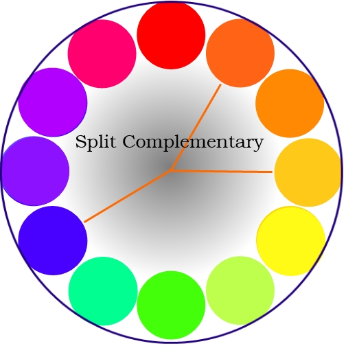
Split-Complementary Color Harmony This harmony uses one hue with two hues adjacent to its complement.
Double-Complementary Color Harmony This harmony is selecting two colors and their complements from the standard color wheel.
Analogous Color Harmony This harmony is selecting related hues from the standard color wheel. These hues are next to each other on the color wheel and have usually 3-5 hues.
Triadic Color Harmony This harmony uses any three colors that are equally distant from eachother on the color wheel. It is usually every fourth color.
Neutral Color Harmony This harmony is a combination of black, white, and grey to make a neutral harmony.
10- There are several factors that influence the way we use color harmonies in our homes. They include what mood or style a person wants, the lifestyle of the family members, the function or the way the occupants will use the room, the items in the room, and the rooms location.
11- When using colors, you want to follow a few simple guidelines to do it correctly.
- It is advisable to first paint a large swatch of the color you want on the wall or foam board to help visualize how a paint color will look on the wall
- You may want to avoid a totally neutral room, but remember, too many strong contrasts in a room can be confusing and tiring
- Color harmonies are easier on the eye when one color, the base color, dominates. The dominant color should be about 2/3 of the rooms area. It can appear cluttered if equal amounts of two or more colors are used
- When choosing colors for a large area, selects low-intensity colors. If high-intensity colors are used in large amounts, they can become overpowering.
- When matching fabrics, it is important to have samples of the fabric you are matching
- If a room is large, try using shades, high-intensity colors, and warm hues to make a room appear smaller
- If a room is small, use tints, low-intensity colors, a monochromatic or analogous color scheme, or cool hues to make the room appear larger
13- If I were helping these two clients to choose a color alternative to get them both to be pleased with what they prefer as individuals, I would suggest using a compliment color harmony. Since one of them wants a warmer room, and the other wants a cool room, This harmony will give them both a pleasing effect. If they wanted, they could use green and red. The red would give the warm, intense hue that one client wants in the room, and the green will give the peaceful, cool feeling that the other wants. This would also be great for reading with the relaxing color of green. A darker room with low natural light will make colors appear darker than in a lighter room.