Friday, May 15, 2015

Field Trip


Field Trip


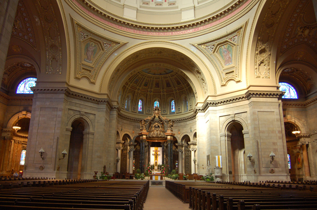
On May 12, our interior design class took a field trip to the Twin Cities to visit some highly architectural areas. Our first stop was James J. Hills house and we got to learn a little bit about the house along with most of summit ave. homes from a tour guide. Every home had its own unique style and stories to go with each. The last stop we made was the St. Paul Cathedral. This was also a tour and we got to learn a lot about what each statue meant, how the Cathedral was found, and other very interesting facts about the incredible architecture. 

     The James J. Hill house was built by James Hill and was completed in 1891. James was born sept. 16, 1838 in Ontario Canada. He later created the Great Northern Railway Company, which was responsible for huge railroad expansions in the U.S. Northwest. Mark Fitzpatrick was the architect for this monstrous home along side James Hill himself. The house has 36,000 square feet of living space.


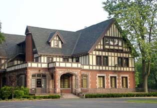
 Originally, in 1859 a photograph by Joel Whitney shows six houses on the hill along Summit Ave. Edward Duffield Neill owned the first house on Summit Avenue, in a location now occupied by  James J. Hill House. Continuing to the left, the photo shows the houses of William and Angelina Noble, Henry F. Masterson, Henry Mower Rice, Henry Neill Paul, and David Stuart. Now the street is full of houses for about 4 1/2 miles. Back then the styles that were common on Summit were Queen Ann and Victorian with some Italian architecture. My two favorite houses were Edward T. Buxtons House, and William Butlers "Lemon Merinque" House. These were my favorite because both had that Italian, Mediterranean feel to them which I love, On the tour I learned that there were 3 houses before the James J. Hills House is located now. I also learned that the statue of Nathan Hale has no significance to Minnesota at all and is rumored to not even be him.
                    Edward Buxtons House                                       William Butlers House

The building of the St.Paul cathedral was instigated by Archbishop John Ireland in 1904. The site before was occupied by the mansion of entrepreneur Norman Kittson. Charles Smith and Alpheus Beede Stickney, two businessmen in St. Paul, purchased the land and donated it to the archdiocese. At Ireland's direction, the archdiocese commissioned well known French Beaux Arts architect Emmanuel Louis Masqueray, who was also the chief architect of the 1904 Worlds Fair in St. LouisMissouri, and construction began in 1906. He had a budget of $1 million, and he based the cathedral on the designs of French churches of Perigueux Cathedral at Perigueux and Sacre Coeur basilica in Paris, as well as French Renaissance and Classical themes. The interior is illuminated by twenty-foustained glass windows. There is also a rose window in the transept. Electric lighting was installed in 1940. The cathedral has statues of the four evangelists in the four corners of its main pier.
Friday, April 17, 2015

Harmony


Harmony

The theme of this room is coastal living. The whites and the grays create unity to keep it simple. With some darker blues, that creates a variety but yet settles well with the whites and grays making the  coastal living of relaxation present.

Kitchen Design


Kitchen Design

I designed both of these kitchens using homestyler.com and they were made for the entertaining family that likes to have people over to socialize.

Indoor

This floor plan in the home kitchen is a very open, L-shaped island kitchen made perfect for socializing throughout the whole room from the cook to the person sitting at the table.

Outdoor

 With the outdoor patio kitchen, using a U-shape arrangement makes it very easy to quickly get around and everything is convenient to get to. With the patio table on the near side of the grill, this makes it quick and easy to hand out food to your summer guests.

Friday, April 10, 2015

Rhythm


Rhythm
This week in interior design we learned about rhythm. Rhythm uses pattern to create unity and interest in a design. It is created when certain colors, lines, forms or textures are used in a consistent pattern. Here are a few examples of 3 different kinds of rhythm.


Repetition
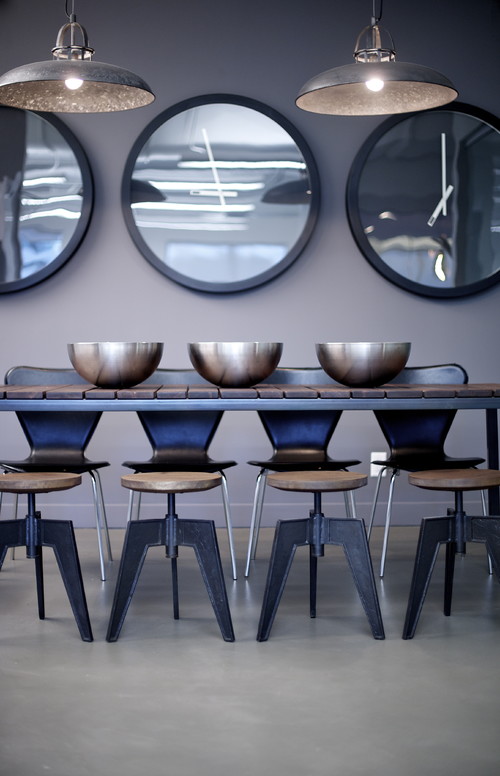
 achieved by repeating any of the elements of design line, color, texture and pattern, light, and scale and proportion or other design concepts in an organized and regular way. In the first picture, repetition is used in the chairs, bowls, mirrors, and the lights. It continues to have the same objects in a uniformed row. In the second picture, repetition is used with the pillars and lights on the floor. There are multiple of each and continue all the way down the hallway.


Radiation
 This rhythm is closely related to radial balance. This type can give a room a circular radial feeling and are arrayed around a center point. In the first picture, radiation is used with the way the chairs are around the table, the circular light bulbs on the light fixture, and the table. This is because the table almost serves as a main center point and the rest of the pieces revolve around that. The second picture is radiation because of the mirror, the light, the footrest, and some of the decor. In this one there isn't a specific center point but things nearby present the radial presence.


Gradation
Gradation is the use of a change in size of objects from large to small or a change in color from light to dark . Gradation is by far the most simplest of rhythms. In the first picture, gradation is present because of how the top shelf is leading your eye down with the shelves getting shorter and shorter one after the other. The second picture is also gradation because of how many holes there are in the wall for the wine bottles to be stored in. On the left there are many more holes than on the right which makes it lead your eye from left to right gradually going down.


Thursday, March 19, 2015

Color Scheme Rooms


Monochromatic


The monochromatic color scheme uses variations of lightness and saturation of a single color. This scheme looks clean and elegant. Monochromatic colors go well together, producing a soothing effect. The monochromatic scheme is very easy on the eyes, especially with blue or green hues. You can use it to establish an overall mood.


Analogous

The analogous color scheme uses colors that are adjacent to each other on the color wheel. One color is used as a dominant color while others are used to enrich the scheme.The analogous color scheme is as easy to create as the monochromatic, but looks richer.


Split Complementary

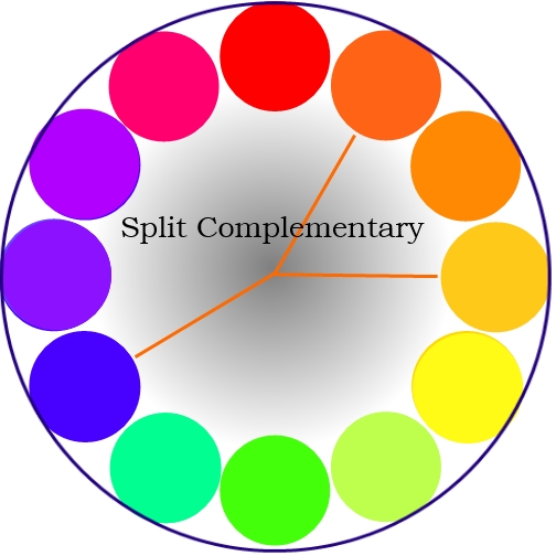
The split complementary scheme is a variation of the standard complementary scheme. It uses a color and the two colors adjacent to its complementary. This provides high contrast without the strong tension of the complementary scheme.


Triadic

The triadic color scheme uses three colors equally spaced around the color wheel. This scheme is popular among artists because it offers strong visual contrast while retaining balance, and color richness. The triadic scheme is not as contrasting as the complementary scheme, but it looks more balanced and harmonious.

Wednesday, March 11, 2015

Color Text Questions


Color Text Questions

1- Factors that can influence peoples reactions to color include age, gender, culture, and life experiences.

2- Red The color of red is associated with power, danger, fire, and passion. It is a bold, aggressive, exciting, and a warm color. It demands attention. Red can make you feel energetic, however to much red can make the room feel overpowering.
Green Green is the color of nature. It is refreshing, friendly, cool, and peaceful. Additional meanings include hope, good luck and envy. 
Violet Violet is a royal color. It is dignified and dramatic.

3- The secondary colors are orange, green and violet. Yellow and red make orange, blue and red make violet, and blue and yellow make green.

4- when talking about tertiary colors, the primary color is listed first.

5-Color intensity is the brightness or dullness of a hue. The middle ring on a color wheel is a colors normal intensity.

6- The difference between a shade, tone, or tint is this. Adding white to a color is a tint, adding black makes it a shade, and adding grey makes it a tone.

7- To neutralize a hue, add some of its compliment.  

8- Warm colors could consist of red, or orange, while cool colors could be blue or green.

9- Monochromatic Color Harmony This harmony can make a room appear larger. It can also unify the furnishings and accessories used in the space. It uses a single hue from the standard color wheel.
Complementary Color Harmony  This harmony can make a room look bright and dramatic. It uses two colors that are directly opposite of each other on the standard color wheel. 
Split-Complementary Color Harmony This harmony uses one hue with two hues adjacent to its complement.
Double-Complementary Color Harmony This harmony is selecting two colors and their complements from the standard color wheel.
Analogous Color Harmony This harmony is selecting related hues from the standard color wheel. These hues are next to each other on the color wheel and have usually 3-5 hues.
Triadic Color Harmony This harmony uses any three colors that are equally distant from eachother on the color wheel. It is usually every fourth color.
Neutral Color Harmony This harmony is a combination of black, white, and grey to make a neutral harmony.

10- There are several factors that influence the way we use color harmonies in our homes. They include what mood or style a person wants, the lifestyle of the family members, the function or the way the occupants will use the room, the items in the room, and the rooms location.

11- When using colors, you want to follow a few simple guidelines to do it correctly.

  • It is advisable to first paint a large swatch of the color you want on the wall or foam board to help visualize how a paint color will look on the wall
  • You may want to avoid a totally neutral room, but remember, too many strong contrasts in a room can be confusing and tiring
  • Color harmonies are easier on the eye when one color, the base color, dominates. The dominant color should be about 2/3 of the rooms area. It can appear cluttered if equal amounts of two or more colors are used
  • When choosing colors for a large area, selects low-intensity colors. If high-intensity colors are used in large amounts, they can become overpowering.
  • When matching fabrics, it is important to have samples of the fabric you are matching
  • If a room is large, try using shades, high-intensity colors, and warm hues to make a room appear smaller
  • If a room is small, use tints, low-intensity colors, a monochromatic or analogous color scheme, or cool hues to make the room appear larger
13- If I were helping these two clients to choose a color alternative to get them both to be pleased with what they prefer as individuals, I would suggest using a compliment color harmony. Since one of them wants a warmer room, and the other wants a cool room, This harmony will give them both a pleasing effect. If they wanted, they could use green and red. The red would give the warm, intense hue that one client wants in the room, and the green will give the peaceful, cool feeling that the other wants. This would also be great for reading with the relaxing color of green. A darker room with low natural light will make colors appear darker than in a lighter room. 


Tuesday, March 10, 2015

Texture


Texture

The placement of my textures was fairly simple and made the room look comfortable. I feel putting the same type of texture together, whether it is visual, tactile, or audible, would of made the room feel segregated. So instead of scattering the objects randomly, I strategicly placed them so amost every different texture is together in the same area. 
Light can effect textures in different ways. Shiny textures reflect more light and appear brighter than a rough texture that does not reflect as much light so they appear darker. Shiny textures pursue more of a formal room and dark is very informal to most people and texture can even make a room size look bigger or smaller. Since soft textures reflect more light, it makes it appear that the room is bigger.
Texture can also effect us in many different kinds of ways. Everything we touch gives us a physical response whether its smooth, rough, soft, or hard and so on. Depending on the kinds of texture, different ones tend to need more upkeep and cleaned more often than others. Also, texture adds character to any room and can even change the sound quality of the room.

Tuesday, March 3, 2015

Lines


Vertical Lines
irene
The placement of lines in this blog are mostly all vertical. The wood panels in the room are all going up and down with the grooves to make the room appear tall. The drapery and windows present a tall, sturdy feeling starting from the floor to the ceiling. The art work in the room also has a vertical stance extending the back wall. In conclusion, vertical lines lead the eye up and down, add height and slimness, and makes the room look thinner.


Horizontal Lines
uncomplicated
This rooms placement of things leads my eye from side to side and adds more width than height. The couch and table present a very slick and long feel with the flatness of them. What really gives it the horizontal feel is the fireplace in the back and the lying down pose statue to represent the relaxation of the horizontal lines. In conclusion, horizontal lines lead they eye side to side, add less height and more width, have a relaxed feeling, makes the room feel wider.


Curved Lines
Pure Love
This room has great representation of curved lines. To start, the table legs, along with the chair legs, both have a curved appeal to them almost like the metal is bent to form a curve. Also, the art on the mirror has smooth edges with curved lines forming hearts to show softness in the room. In conclusion, curved lines make space look bigger, increase size and shape of figure, is more formal, and has soft edges.


Diagonal Lines
Smoke and Mirrors
This room represents the diagonal lines. The design in the window panes are perfect slanted lines that instantly draw attention to the back of the room. Also the detail design on the side of the couch has diagonal lines. Statues can also have a slant to them and the one on the table against the back wall is leaning in a slanted line. In conclusion, a diagonal line is slanted, draw attention, make vertical slants slender, and make horizontal slants more width.

Monday, March 2, 2015

Housing Styles


Housing Styles


This week in Interior design, we are learning about the different kinds of housing styles. Every different kind of home style has their very own architectural uniqueness. It is important to know all the styles because then we can understand when the houses were popular, why they were designed that way, and where the style originated from.


Saltbox-   A Saltbox is a building with a long, pitched roof that slopes down to the back, generally a wooden framed house. A saltbox usually just has one story in the back and two stories in the front.


Garrison- A Garrison house typically has two stories with the second story overhanging the front. Usually have an exterior chimney at the end. Typically has narrow clapboard siding with minimal trim and decorative details.


Georgian- Often characterized by the rectangular architecture. Around the main door there are often classic columns or pilasters and a round arch. The roofs are pitched from which several chimneys can come out of. Some original Georgian houses have wooden siding or brick.


Federal- This style is usually characterized by a symmetric facade, often with a giant entrance portico. Commonly brick constructed with thin mortar joints or clapboard over timber framing with corner boards. Seen with palladian windows, columns or palisters. The low pitched roof often disappears behind a balustrade. The windows on the lower level are taller than above.


Greek Revival- inspired from the Roman temples, this style shows power and is often white to represent marble. There are columns in the front that structure a classical portico.


Cape Cod- External walls of classic Cape Cod houses are covered with unpainted shingles or clapboarding. They usually don't have front porches. It has a steep pitched roof, with or without dormers. Built more to withstand stormy weather.


Gothic-Revival- Also known as the Victorian Gothic, Gothic revival uses alot of decorative patterns, finials, scalloping, lancet windows, hood moldings, and label stops. Also resembles a dark but romantic age. Includes high pointed arches, high pitched roofs, and sometimes towers.


Row House- Also known as town houses, the Row house were built on narrow, long properties, so they had narrow fronts with several stories above. Low pitched, or gambrel roof sometimes with dormers or a gable. Semi circular or elliptical fanlights are common above front doors. It has a raised foundation with the windows in a symmetrical column or row.


Italian Villa- commonly seen with classic columns or pilasters, and round arches and pediments over doors and windows. Also quoins were popular on the corners of the house. The exterior walls were made of stucco and brick to make the house cooler in intense heat and along with the clay shingles.


Stick Style- The stick style house is identified by its decorative woodwork, especially for porches, around doors and windows, and brackets supporting the projecting eaves of roofs.


Art Nouveau- This style is very decorative, using human faces wearing fanciful headdresses, plants, and flowers which are most common.The decoration can be molded in stucco or cement and worked in color in stained-glass windows.


Queene Anne- Queene Anne us a very romantic style often with towers and turrets. Porches, balconies, and bay windows are also very common. Elaborate exterior woodworking called gingerbread was a way to show off the new power tools. Its use of low arches, dark sides, often of shingles, stone, or brick gives it the cozy warm feeling.


Tudor- In this style roofs are steeply pitched, with sharp gables dominating the front sometimes with a chimney. Half timbering is visible on the outer walls. A mixture of materials is used including brick, wood half timbers, stucco, and patterned stone. The chimneys are often topped with chimney posts.Narrow casement windows are often grouped in bands along with bay windows sometimes protruding from the second floor.


Dutch- A dutch style home is found with a unique stepped style roof rather than a triangular gable. Made with a brick or stone.


Spanish- This house is made of poured cement or stucco with the details in wood. The red tiles or clay roofs portray the Spanish look. Typically white or light colored to make the house cool in hot climates.


Prairie- Also known as the Frank Loyd Wright house. The house has very long, low lines, with open balconies and spreads of windows, all reflecting the flat, open environment of the land. Everything is going off of a horizontal style.


Ranch- The Ranch style home is long and low, usually only one floor. They often featured large front porches and also a back patio. Early styles had a large picture window, where today they are dominated by a garage.


International- This style has influenced commercial buildings. The idea that less is more comes to play with the simplicity of the use of glass, metal and a geometrical feel in the modern look. The international style looks like cubes or boxes grouped together to form a different shape of a house. Sometimes the home sits on the ground and sometimes it is raised on columns with the garage underneath. The roofs may be flat or with a single slope.


Split Level- Related to the Ranch style house, but with three levels of living space rather than one. The garage is commonly found in the ground while the main floor is at ground level, and a top floor above the garage.


Rustic- A rustic house gives the feeling of woods, lakes, and outdoors. More as a vacation home or cabin style designed in wood and rocks.


Chalet or Alpine- Also known as a swiss mountain cottage with big overhanging eaves. Typically found with a long porch around the back of the house. Also gives the rustic feel with the use of wood and rock. Common with steep gabled roofs with lots of windows to show the view.


A-Frame- Shaped as the letter A, this house serves as both the roof and the side walls of the building. Common with vacation homes.


Dome- Made of very light but extremely strong triangular panels, arranged in the shape of a hemisphere. Two or more are sometimes grouped together to make a bigger home design.


Solar- These homes are designed to run off of nature, using heat and light from the sun for a source of energy. There are two main types, active solar and passive solar. Active solar houses use panels tilted toward the sun to absorb solar energy and covert it into heat. Passive solar house rely less on technology. They have south facing windows for the winter sun to bring heat, and shading devices to block the hot summer sun to cool the house.


Earth Sheltered- Also called underground houses. They are most often banked with soil at the back and sides. The roof may also be covered with earth to. Often have a low, long, narrow shape.


Manufactured- Also known as a modular home. Built entirely or partly at a factory which are then transported by a truck to the actual building site. Some come in sections and have to be assembled.


Mobile Home- Factory built home delivered by a truck like the manufactured home. Common in "trailer home' parks. They have a long , narrow, trailer like form.


Duplex- This house combines two housing units in one building. The two units may be next to each other or on separate stories. Also called a double house, double-decker, twin house or a two family house.


Neo-Eclectic- These houses take different designs from different styles of houses. They try to portray the modernist look. Includes alot of brick or stonework.


High Rise Apartment- Three or more living units joined together are usually called apartments. They are typically stacked on top of each other to form almost a sky scraper feel, hence the name high rise. It is considered a high rise if it is six stories or higher. They are built in busy city areas to conserve space and also have green areas between adjacent buildings for parks or playgrounds.


Bungalow-  Very typical in California, this style leaves its building materials as close to the natural state as possible. Wood is left unpainted or stained, and exposed rafters or braces can often be seen beneath roof overhangs.